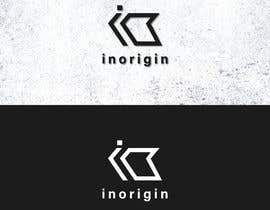
Design me a Logo - 22/01/2022 17:05 EST

  • 状态: Closed
  • 奖金: €20
  • 参赛作品已收到: 391
  • 获胜者: Manzarjanjua

竞赛简介

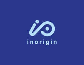
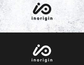
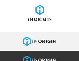
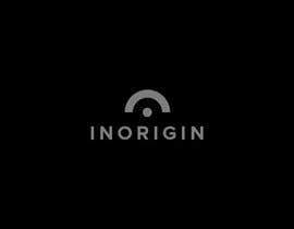
We are looking for a Logo for our new Product Design Engineering Business.

We normally take inventors, startups or larger businesses by the hand, starting from an idea or a sketch and working through developing an idea into a functional and aesthetic product. We make sure that it can be manufactured and hold their hand through the whole process until a product is introduced to the market. Seeing the product launch even for small Amazon products is our pleasure! Many of our past cooperations have gotten huge amounts of investments and crowdfunded projects at the very early stage just because we put in our innovative way of working and brought their idea to life!

We want to define and communicate clearly what we offer and who we offer to, our high-end product design services to. We need a sharp Logo to help reflect this.

I don't care what the colors are (I'll give feedback as I go)
The brand name is "inorigin"

I'll be very active in my feedback so we can narrow down a logo together. I'd like to work together in the future too if it all works out (I need a quick graphics guy)...

I'd like to have the logo look flat, with a little "grunge" look in it...

Thanks guys!

您还可能感兴趣的技能

雇主反馈

“Raja is very creative and can align with your thoughts easily coming up with different approaches that will surprise you. Definitely recommended for Logo design.”

个人主页照片 Yontash, Greece.

公共说明面板

  • Yontash
    竞赛主办者
    • 2 年 之前

    Gaps between lines should also have a min of 1.2mm

    • 2 年 之前
    1. Manzarjanjua
      Manzarjanjua
      • 2 年 之前

      Please check my final entry #450 , I would make revisions if required.

      • 2 年 之前
  • Yontash
    竞赛主办者
    • 2 年 之前

    Hey everybody. Thank you for your entries.

    Trying to come to a conclusion. To do that I need to add another parameter which will allow me to decide.
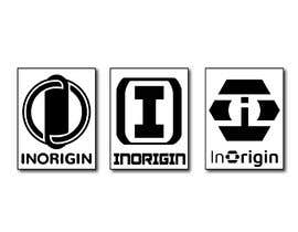
    I like most ideas implemented with I and O. At this point I would need to see it in realistic proportion.

    The logo sign should fit in a rectangle of 10-13mm The line thicknesses in this case can be between 1.2 to 1.6mm.
    Please show me the proportionate version as described in Black and white colors monotone.

    • 2 年 之前
  • SHIMINAAKTER
    SHIMINAAKTER
    • 2 年 之前

    please check my all entry #340

    • 2 年 之前
  • faridhasan764
    faridhasan764
    • 2 年 之前

    #333

    • 2 年 之前
  • abedaakter78
    abedaakter78
    • 2 年 之前

    please sir, check my all entry#317#317 #321

    • 2 年 之前
  • faridhasan764
    faridhasan764
    • 2 年 之前

    #303

    • 2 年 之前
  • Yontash
    竞赛主办者
    • 2 年 之前

    Checked all and ranked. Unless it is a 3 or more it is not going in the right direction. None of the designs is there yet

    • 2 年 之前
    1. zubairsfc
      zubairsfc
      • 2 年 之前

      Hi sir I am a logo designer Please check my profile portfolio https://www.freelancer.com/u/zubairsfc if like my profile please contact me private message and quick response and please hire and recommend i am always online i am waiting for feedback now Thanks.

      • 2 年 之前
    2. smabdulhadi3
      smabdulhadi3
      • 2 年 之前

      Entry #201 by Shah Muhammad, a new thing, check it, please.

      • 2 年 之前
  • SHIMINAAKTER
    SHIMINAAKTER
    • 2 年 之前

    I tried to do as you say. please check my entry #173 / #172 / #169

    • 2 年 之前
  • JmDesighner
    JmDesighner
    • 2 年 之前

    Please Check #154

    • 2 年 之前
  • JmDesighner
    JmDesighner
    • 2 年 之前

    Please Check #153

    • 2 年 之前
  • Yontash
    竞赛主办者
    • 2 年 之前

    Please read the comments.
    The ones I have rated 3 or above are going in the right direction.
    The ones below 3 are either duplicates or going in a direction I am not interested in.

    Please try to make some combo of the I and O of InOrigin that is minimal thus sharp and professional. Sharp triangular edges are something to avoid.

    • 2 年 之前
  • Yontash
    竞赛主办者
    • 2 年 之前

    Please post your submission of different views of the same logo in the same submission instead of multiple submissions of different angles. Thank you

    • 2 年 之前
  • Yontash
    竞赛主办者
    • 2 年 之前

    Hey everyone. I took a look at every idea posted. I would like to see some combo of the I and the O that would make the logo easy to be used as favicon and square versions.

    • 2 年 之前

显示更多评论

如何以竞赛开始

  • 发布您的竞赛

    发起您的竞赛 快速简单

  • 获取众多参赛作品

    获取大量参赛作品 来自世界各地

  • 悬赏最佳参赛作品

    悬赏最佳参赛作品 下载文件-简单!

立即发布竞赛 或者立即加入我们!