
alfasatrya
Indonesia

I need 3 graphics; each rendered on an iPad, Phone, and Macbook screen (9x Ai files total.)
Our brand image: high-tech, friendly, and intuitive.
You *may* use free images (such as a computer on a desk where you can insert the graphic, or someone holding an iPad) but I need the product images to take up 80% or more of the total image if you choose to do so. This is *not* a requirement.
I poorly mocked up 2 of the 3 images.
We have 3 products;
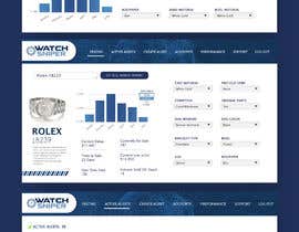
1. Free service to check the value of a watch. Where it says "Rolex 18239" is meant to be a text entry box. If you look at Demo1.JPG - just imagine the same type of interface, but without all the text between the 2 grey bars (current value... time to sale... current price low.. volume sold... all of it gone). Added to what I currently have there (use the exact same text values) I want 2 entry boxes (such as Size, and Box/Papers) added - the name of box 1 will be "Case Material" and the value inside the box will be "White Gold"; - box 2 will be "Precious Gems" and the value inside the box will be "None". The grey arrows next to the boxes are attempting to display that it is a drop-down menu. There should be no header on this webpage graphic (the lighter and darker blue areas) - Just the contents of the webpage with our header (provided: WS Header; crop/size to your choosing, but maintain proportion)
2. A paid service, exactly as seen in Demo1.JPG. Where it says "Rolex 18239"; is meant to be a text entry box. I realize this is a terrible graphic and I want a professional to make it look incredible. The same 2 boxes from the first graphic will be added - box 1 will be "Case Material" and the value inside the box will be "White Gold" - box 2 will be "Precious Gems"; and the value inside the box will be "None". The text values should all remain the same. The chart can look much better - use the numbers on the chart, but pick whatever chart style you feel looks best. The tabs across the top/side/wherever you choose to place them, should be "Pricing", "Active Alerts", "Create Alert", "Accounts", "Performance", "Support", and "Log Out" - and should contain our logo (taken from attached .ai file) somewhere along the top bar. The "6 Month >" on the chart is intended to designate that different time-periods can be selected.
3. With the same headers and logo placement as #2 - "Pricing", "Active Alerts", "Create Alert", "Accounts", "Performance", "Support", and "Log Out", the selected tab should be "Active Alerts" - you can retain all text from this page, but this is our core product and I want it to really stand out as an incredibly versatile, useful, intuitive tool. As an example, a user would navigate to the "Create Alert" tab, fill in certain criteria (such as a watch brand and model number) and it would be added to active alerts. A user may have up to 10 active alerts, and I want an example of one active alert fully displayed, and an implication that there are several more available. Remove the "Edit Alerts" text and arrow, and give a theoretical way for a user to delete an alert. Fonts should be the same across all 3.
This project is posted with the intention of giving you total creative license on how the layout should be. As long as the core elements are there, the design is all in your hands. The colors are #3E5D93 and #8EA6CD; #FFD45A MAY be used as a highlight color, but would prefer to stick tothe 2 primary colors and black. Full color palette is included (Website Color Palette.) I created the mockups in paint.net to think through the features needed in each of the 3 products, but I am no website designer nor graphic artist.
The contest will be ended as soon as I receive a design that matches the criteria.
“Great iterations, responsive and understanding, great fast designer”
![]() galenbusch, United States.
galenbusch, United States.


