
公共说明面板
-

greatdesign83
- 12 年 之前
............. #34 , #35 , #38 , #42
- 12 年 之前
-

b0bby123
- 12 年 之前
#70 ? Thanks
- 12 年 之前
-

jomeba
- 12 年 之前
Hello, please take a look at #54 #40 .
- 12 年 之前
-

patrickpamittan
- 12 年 之前
Any feedback #73 #71 #69 #67 #65 #64 and #63? Any modifications will be made. thanks
- 12 年 之前
-

pramoad
- 12 年 之前
Hey
Please check #59 , changes can be made.
thanks- 12 年 之前
-
pramoad
- 12 年 之前
Hey
Please check #58 , changes can be made.
thanks- 12 年 之前
-
maani101
- 12 年 之前
hi, Please check #47 , changes can be made.thanks
- 12 年 之前
-

竞赛主办者 - 12 年 之前
Hi folks. My apologies, this is the first time I've scrolled down enough to see this feedback section. It's the first contest I've run, so I'm new to this. I reckon as it's a bit late for feedback at this point, but I like the overall look and feel of #6 with a bit more color as it's a little washed out. The buttons are correctly laid out as well. Thanks.
- 12 年 之前
-

carljosephsmith
- 12 年 之前
Hi there
Some feedback would be greatly appreciated still. There's plenty of time to do another design or change existing ones, but if you don't really like my style, there's no point me wasting both our time doing more of it.
Please do give feedback, even if the competition has ended. It is always welcome.- 12 年 之前
-

gotaloha
- 12 年 之前
Hi throtmorton, I just made a quick color adjustment layer in the PS file to add a hint of some color to my design #43 . The color can be easily changed to anything you require, I simply chose a slight blue tint to keep the look more subdued. Please let me know if you want to see any further refinements!
- 12 年 之前
-
greatdesign83
- 12 年 之前
@carljosephsmith
Why blame to me brother? It's my own idea. (Please pay CLOSE ATTATION to my creation) I did not copyright anyone even you too. I think you are very smart then me, so I hope you do not hammer with me Please. Thanks!- 12 年 之前
-
carljosephsmith
- 12 年 之前
GD, you entered a dozen or so times and none of your designs looked anything like your new one. Nobody had done grooves, or put the brand up top in the groves, or used a coffee colour scheme. As soon as I introduced those ideas, your new submission suddenly has groves in the place, it has a brand in between them, and it is even the same colour as mine.
Do you really expect us to believe that that was a coincidence? It's nothing to do with copyright. It's to do with the Freelancer rules. You can't take one guys original contributions and just add them to your own stuff. That's evidently what you did.- 12 年 之前
-

badhon86
- 12 年 之前
Hi "CH" here is my another design. Please take a look #36 . Thanks
- 12 年 之前
-
carljosephsmith
- 12 年 之前
@greatdesign83
Can you stop using my design elements please? You're just biting my styles. You've taken the branding idea, it's location in the top groove, which I also added first, and you've taken my actual palette as well?? Did you download mine to use as a starting point?
Play fair.- 12 年 之前
-
greatdesign83
- 12 年 之前
.................. #34 ............... Please see it.
- 12 年 之前
-
carljosephsmith
- 12 年 之前
I just added a different version. I put a little space in for a brand. If you let me know what your application is called, I'll edit the proper name in. It'd take about five minutes. I changed the colours and buttons a bit too. Let me know what you think.
Thanks- 12 年 之前
-
carljosephsmith
- 12 年 之前
@mafreemarket
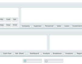
Just a heads up chap: You've got a typo on the Personnel button and you really need a space after the full stop in Bal. Sheet. I think the On Off buttons you've done are much better then the round ones in your other submission.- 12 年 之前
-
carljosephsmith
- 12 年 之前
I'd be happy to submit another design before the competition ends, but would really appreciate some feedback on what people have submitted so far, just so I know what you like and don't like.
Thanks- 12 年 之前
-
patrickpamittan
- 12 年 之前
what do you prefer kind of design? Futuristic? or minimalistic?
- 12 年 之前
-
carljosephsmith
- 12 年 之前
That's #25. They should allow you to update stuff on here. I really am sorry to clog up the thread with junk.
- 12 年 之前
-
carljosephsmith
- 12 年 之前
Sorry to keep changing things, but I wanted to get it exactly right.
Mine's number #24.
Cheers
Carl- 12 年 之前
-
carljosephsmith
- 12 年 之前
Nope. Make that #20. I really don't like the way the site renders submissions. It can really mess up the details.
If you'd like anything changing, please let me know and I'll get it done.
Thanks
Carl- 12 年 之前
-
carljosephsmith
- 12 年 之前
Sorry, make that #19.
- 12 年 之前
-
carljosephsmith
- 12 年 之前
Count me in.
#18- 12 年 之前
-

MatrixServer
- 12 年 之前
Yep,thormortn #15 is my design. Any feedback is appreciated. 10x
- 12 年 之前
-

cowboyrg
- 12 年 之前
Sir, for clarification, is the attached image the actual template we are supposed to work within, or is it just a guide for us to create something different as long as the same elements are there? Thank you!
- 12 年 之前
-
badhon86
- 12 年 之前
Hi throtmorton, here is my design #14 . Please take a look. Any feedback is highly appreciated. Thanks
- 12 年 之前
-
gotaloha
- 12 年 之前
Hi, I entered #6 for your consideration. The Photoshop file is well arranged and easy to edit. Let me know if you want to see any adjustments, thanks!
- 12 年 之前
-
pbgrafix
- 12 年 之前
I Submitted #3. Two versions to compare. Changes can be made if necessary. Feel free to contact me if you would like to see any changes.
- 12 年 之前
-

Lozenger
- 12 年 之前
Submitted #2 with the same proportions, light colours, with and without text labels, and with 'on' and 'off' buttons.
Any feedback or suggestions for improvements are greatly appreciated!- 12 年 之前


