imranhassan998
Bangladesh

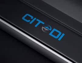
Update 2: I see that you all trying to do something with the O. It's not something mandatory. Im looking for a lean logo very clear and New, you have to try things. Its Nice to have something but the typo of the logo must be lean.
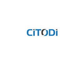
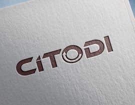
Update: I see freelancer uploading 3D logo, I need to see a 2D logo on a white/black background.
3D logo are not relevant.
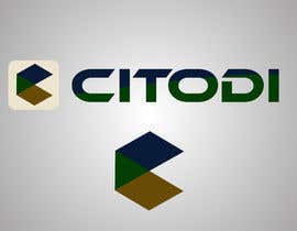
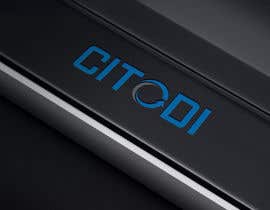
We are looking for a new logo for our company.
We develop algorithms for route optimization.
Our company has a logo that looks too "childish" and we would like a more professional, smoother, design logo that has to be very clear to read.
We would like to keep the color of the logo, this kind of blue.
The style in the O has to be remove, you have to find or a new style or just take it off.
You are completely free.
We need a logo more established company and also that is more 21st century.
Thank you,
, we would appreciate seeing the logo in 2D.
If you have a gif idea, nice to have also.
“Very good. ”
![]() bouajo7, France.
bouajo7, France.