Tweak logo for tech company
- 状态: Closed
- 奖金: $15
- 参赛作品已收到: 26
- 获胜者: asharjamil
公共说明面板
-
竞赛主办者 - 9 年 之前
so far i like 43, 44, 45, and 46 the best. good job asharjamil!
- 9 年 之前
再查看1条消息
-
竞赛主办者 - 9 年 之前
please finish steps to complete hand over.
- 9 年 之前
-

asharjamil
- 9 年 之前
I am on it.
- 9 年 之前
-

Munivarya
- 9 年 之前
any light on #32
- 9 年 之前
-
竞赛主办者 - 9 年 之前
I like the font in 20 the best
- 9 年 之前
-
ranjanodedra
- 9 年 之前
sir please check my antry number 38 ...ranjanodedra and tell me any change if u want to make i can do it in few minutes thanks.
- 9 年 之前
-
ranjanodedra
- 9 年 之前
sir please check my antry number 38 ...ranjanodedra ..thanks
- 9 年 之前
-
竞赛主办者 - 9 年 之前
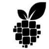
the berry in 5 looks really clean. I like it a lot! If it can be merged with 16 that would be awesome.
- 9 年 之前
-
竞赛主办者 - 9 年 之前
The logo that we have looks too busy and doesn't flow. I want to see what can be done to make everything look a bit sleeker.
- 9 年 之前
-

Attari Bros
- 9 年 之前
what kind of updates you want?
- 9 年 之前


