elinelecoutour
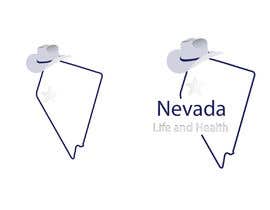
France

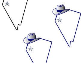
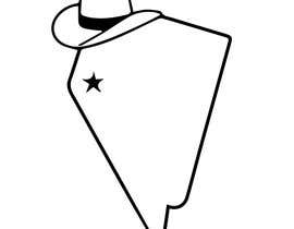
Attached is a copy of our generic logo. We want to update it and make it look a little spiffier.
Here are a few specifics about the current version.
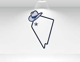
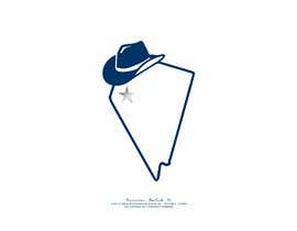
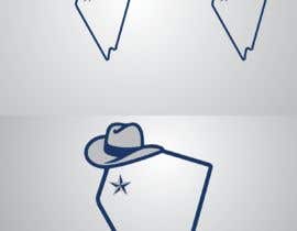
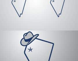
1. The hat is not well-positioned. It is supposed to be "hanging" on the top left side of the state logo (this is State of Nevada, USA). Right now it looks more like it is sliding down the side. It should look more like the state outline is kind of like a hat rack and the hat is resting naturally.
2. The actual hat used in the current version is really rinky-dink and needs to be upgraded to a better looking hat that is a clean cut icon of some sort.
3. The star represents the state capital city of Carson City. The star used in the example is too basic. It should be spiffed up a little somehow and probably just a little larger, but not too much larger.
4. The width of the outline of the state turns out to be a little too thin for using this logo on business cards. It could be slightly thicker, but not too much so.
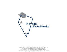
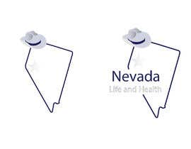
5. The actual html of blue used should be
6. The other color that should be used is silver - it has not been used at all in this example. Nevada is the "silver state" and the 2 colors on the graphic should be Nevada blue and silver.
Here are the actual html hex codes:
Blue: 003366 - rgb(0, 51, 102)
Silver: 807f84 rgb(128, 127, 132)
Grey 999999 rgb (142, 146, 149
*note - the code used for silver is not really silver because actual silver is really difficult to pick up on a white background - if you are able to create a silver color that looks great, feel free to experiment with it
7. The tilt of the state is correct and should remain - do not "straighten" the state outline. This "tilted look" is how Nevada actually looks on a proper state map of the USA.
General Parameters:
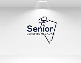
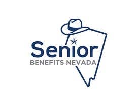
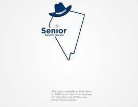
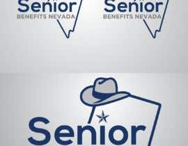
This new update will be our generic version. We have 2 or 3 different company names that we plan to use to go with the logo in the future. Typically this would entail "breaking" the state outline on the right hand side (or possibly the left hand side) to allow some lettering there.
Here are a few company names if you'd care to experiment - but this is NOT part of the project requirement.
Nevada Life and Health
Summerlin Benefits Group
Insure Nevada
Senior Benefits Nevada (originally the star had served as the "dot" on the letter "i" in the word "Senior")
We may want to have some kind of icon in the south tip of he state to represent Las Vegas. Again, not a requirement for this project - just something we have thought about doing. For example, using an icon of the famous Luxor bright light at night, or the Stratosphere or even hockey sticks with or without a puck to represent the new Vegas hockey team presence.
The final product needs to be available in vector to retain 100% consistency when resized. It will be used as a logo on many different things including websites, business cards, letterhead, etc.
It is anticipated that we will allow the winner to do some additional work for us.
Thank you for your participation! We look forward to seeing your work product.
“good communication and timely results”
![]() jbage007, United States.
jbage007, United States.